Our tiny 70s bathroom makeover
Ohhh this feels like a real trip down memory lane - to be blogging about interiors again! I thought it was a time to switch it up from the endless chat about writing/parenting, so here we are: the first in what I hope will be a series of posts all about our house renovation.
Now, nearly three years ago, when we first moved into our 70s house in suburbia, I did a little house tour post. You can see it here. I ended it by saying I was definitely going to do some posts on what we did to the house soon. Sorry! But better late than never huh?
Anyway, if you follow my Instagram you might know that last year we did a massive building project. We moved out to my parents’ for ten weeks and basically gutted nearly the entire house, adding a small extension on the back. It was one of those ‘we should build an extension’ jobs that just grew and grew, until the next thing we knew we were rewiring, replumbing and had two new bathrooms and a new kitchen and a brand new patio that might just be my favourite thing ever.
I really want to get the house professionally photographed, but I’ll be honest - I can’t see myself getting around to it anytime soon. So, before I forget everything we did, I thought I’d do a little series of posts on each of the rooms we had redone. And for no particular reason, I thought I’d start with the bathroom. I apologise in advance for the bad photos - my sister (professional photographer) will be disgusted I’m sure. It’s really hard to photograph white rooms without the light levels going mental, so bear with me please!
Now, I know 70s houses aren’t to everyone’s tastes, but we are massive fans. We love the huge amount of light you get in every room, the generous proportions, internal windows, decent-sized hallways and the fact that they generally flow really well. But there’s one thing about 70s houses I don’t like - and that’s the tiny bathrooms. I say bathrooms, but we only have one bathroom upstairs, and that’s also a bit of a downside, as we have four bedrooms. We discussed trying to squeeze an ensuite in somewhere, but I actually hate ensuites (who wants to listen to your partner on the bog while you’re lying next door in bed?) and in the end the hassle just didn’t seem to be worth it. Every house has a compromise right? And the small family bathroom definitely is it in ours. Because I love everything else to bits!
This is the only ‘before’ picture I have of the bathroom, and it’s one of the estate agent pictures from when we bought the house. There was nothing wrong with the bathroom, per se (it was euphemistically described as a ‘luxury’ bathroom in the sales details). But it was so utterly boring and lacking in any kind of character. I don’t know why people don’t have a bit more fun with their bathrooms. They don’t have to be completely dull you know! I hated the shower pump being exposed too - it was a nightmare to keep clean.
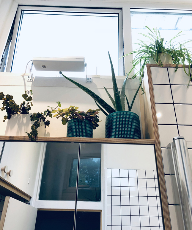
Anyway, one of the good things about this room is the huge window above the basin (you can’t really see it in the photo above). We have an unusually shaped roof (and no loft) so the ceilings in the upstairs rooms go right up to the roof. The trouble with this high window is that you can’t reach it unless you’re 7ft tall, so the lady who owned the place before us had fashioned this rope pulley system in order to open and close it, which hung down in front of the basin most of the time. It was my number one priority to get rid of this damn rope, so after much research we discovered what we needed was an electric actuator, the type usually used in greenhouses (!). It doesn’t look too pretty, but at least we can now open and shut the bathroom window using a simple electric toggle switch.
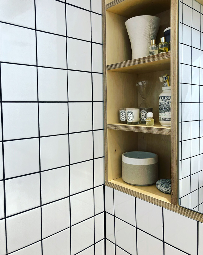
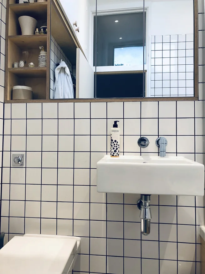
Other than that, our biggest priority was storage. There was hardly any in the bathroom as it was - just that poxy cupboard under the basin. So we decided to hide all the plumbing by building a false wall and above that, creating a mirrored cabinet the entire width of the wall, providing loads of storage. We also removed the old water tank when we had the house replumbed (we fitted a new combi boiler) which meant we gained a huge storage cupboard on the top left of the bathroom - this is basically our only loft space, and now houses all our luggage!
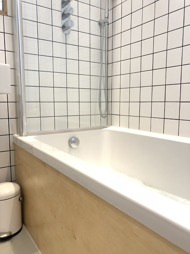
I knew I wanted lots of plywood in this room. I also knew I wanted grid tiles with black grout. It took a lot of persuading on my part to convince the builder (and Oli) that I wanted black grout - and I’m so glad I put my foot down. ‘Graph paper chic’ was what I said I wanted, and I think we got that. With some nice plywood details and a shelf above the mirrored cabinet for my plants, as well as open shelving to the left.
We picked the biggest showerhead we could, and it’s absolutely brilliant. We also have a hand-held shower attachment so we can clean the bath without too much trouble. Sanitaryware wise, we wanted a wider bath (as it’s a shower bath too), and a back-to-wall WC that was as compact as possible. As I said, this room is so tiny. Once we’d squeezed all that in, finding a basin that fitted the space was really hard - in the end we had to go for a largeish cloakroom basin. My dad thinks it’s ridiculous, but sadly a wider one would have made the room feel even smaller.
It’s not ideal, and bathtimes with Daph can get a bit stressful as I feel like there’s just nowhere to move sometimes. But I love how light, bright and simple the overall feel of the room is, and the fact that it’s sympathetic to the era of the house, without being too much of a pastiche. We were going to choose cork tiles for the floor, but the style we liked wasn’t recommended for use in bathrooms, so in the end we went for a simple rubber floor. It’s pleasingly clean and neutral but it’s also far too light - in hindsight I would have picked a darker shade, as water splashes show up really badly so it always looks dirty!
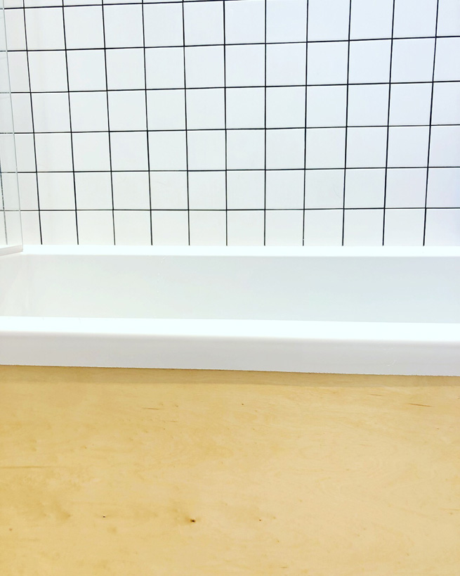
Finally, I wanted the biggest towel rail possible, and this is hidden behind the door. It holds all our towels, so we always have something cosy to wrap ourselves in after getting out of the bath or shower. I think my favourite feature of the room is the plywood bath panel - it’s so beautifully finished and I just love the colour of the wood.
Anyway, here’s the great long list of where everything was from, just in case you’re interested. Any questions, leave me a comment! And I promise not to wait another three years before posting any more interiors blogs :)
Basin - Aston Matthews. Taps and shower fittings - Crosswater. Toilet - VitrA. Bath - no idea sorry, builder supplied. Shower screen - Novellini Aurora. Flooring - The Colour Flooring Company. Towel rail - Victoria Plum. Bath panel and cabinet - bespoke. Tiles - British Ceramic Tile. Grout - BAL Adhesive Micromax 2 in Anthracite. Window actuator - Venset. Loft cupboard handles - Chocolate Creative.
The RIVAL is currently available for just 99p in the Kindle Spring Sale! UNFOLLOW ME will be published in June.
Sourcebook: My Bathroom
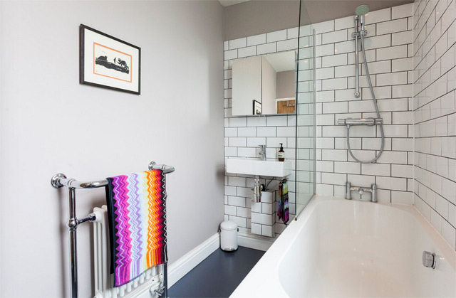 The baby is still enjoying a delightful period of night-time wakefulness (basically, wakes at 2am screaming for no apparent reason - beginning to suspect teething; and then 5.30am whereupon she decides it's time to start the day), so I'm a little sleep deprived at the moment. Hence this rather uninspiring post - the last one detailing all the bits and bobs in my home. I've already done a blog post specifically about my bathroom makeover, but here's a list of all the products you can see in the pictures in case you like any of them!
I've decided not to do a similar post on my kitchen as to be honest very little of it is of my choosing - the cabinets are Ikea and fine but not what I would have picked, the worktop is also Ikea and is a white laminate, the flooring is godawful and I have no idea where it's from, the walls are painted in French Gray from Farrow & Ball. If you want to know any more about it then do drop me a line/leave me a comment.
But enough of that, on to the bathroom - done on a massively tight budget, I think it cost me about £2k in materials and then another £1.5k in labour.
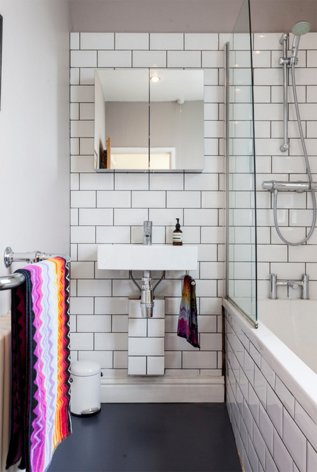
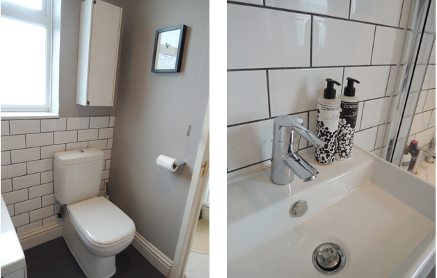
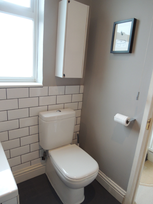
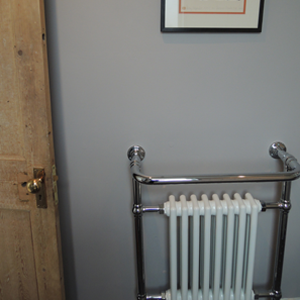
Wall colour, Dove Tale, Farrow & Ball Flooring, vinyl in Slate Grey from The Colour Flooring Company Tiles, Topps Tiles Basin, Bauhaus from CP Hart's trade centre All taps and shower fittings, Grohe from Amazon Towels, Missoni Home from Heal's Bath, was existing bath Toilet, Duravit from CP Hart's trade centre Towel rail, Victoria Plumb Cabinet above basin, Homebase Pedal bin, SimpleHuman Cabinet above toilet, Ikea (spray-painted white)
All photos (except the last two) copyright Houzz UK and taken by the supremely talented Chris Snook.
Bathroom reveal
So...it's been a while since I finished my bathroom, but I was waiting for some LIGHT and SUNSHINE in order to photograph it. But look, we had five minutes of the stuff on Tuesday and now it's buggered off again. So I've given up. Here's the bathroom, in the delightfully dull March light we're all now so depressingly used to. Am hoping that by posting this, the sun will decide to appear and stick around, just to spite me for not waiting a little bit longer. You may remember my personality-less bathroom from my post before here...
Grim eh? But here it is now... *ta-daaaa*
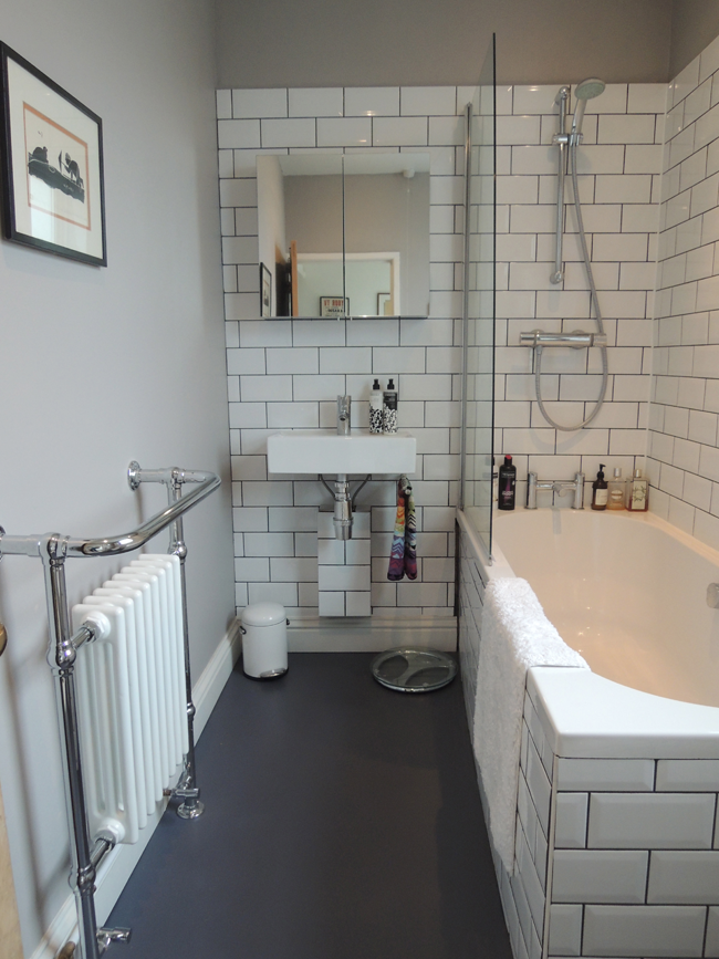
As you'll see, I didn't have the guts to go for the greeny-blue walls in the end. I was massively tempted, but decided it would look out of place with the rest of the flat, which is very light and bright. And also my uber-stylist friend Poppy Norton reminded me that if you want to do your make-up in them, it's good to keep bathrooms light as possible. The wall colour I went for in the end is Dove Tale, by Farrow & Ball, and is a really interesting shade - that goes from very pale purpley-grey to a sort of warm mushroom-brown, depending on the time of day. It's great because it gives the cosy feel I was after, without being too dark.
 |
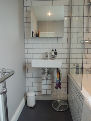 |
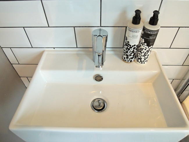
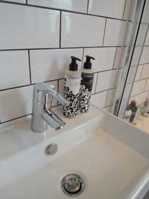
The sanitaryware was a bargain - the basin (Bauhaus) and toilet (Duravit) were both from CP Hart's trade centre. I reused my existing bath. The shower and basin and bath taps are Grohe, and I bought them on Amazon!
 |
 |
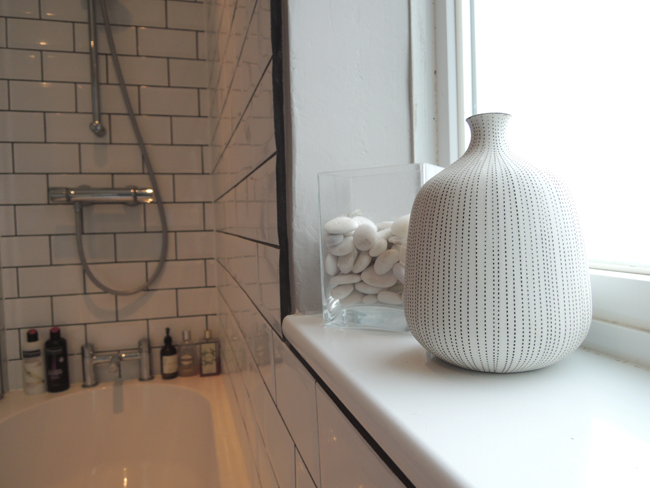
 The flooring is from the Colour Flooring Company - and I love it! So soft and warm underfoot. The tiles are from Topps Tiles.
 |
 |
In total I spent just over £3k, including fitting, which I think is pretty good. It's not perfect, and as with any interiors junkie there are a few things that I wish I could change - or could have afforded to have done - but the main thing is it has personality, is warm and inviting, and puts a smile on my face first thing in the morning!


