Our (not so) new house!
Finally! It's my long overdue through-the-keyhole post! Sorry it's taken me so long to get this up - to be honest I wasn't really sure how to approach blogging about the house because we've done a few bits before moving in but really it needs a LOT of work, but the budget and time aren't quite there yet. So I thought I'd start with the 'Before' pictures - here goes! - here's what our house looked like when we first got the keys. These pics were taken by Oli, so apologies that they're not hugely professional! They weirdly make the house look quite dark when it is anything but.
A little bit more about it... it's a four-bedroom terraced house in a really lovely little cul-de-sac in a rather pedestrian town in Surrey. It was built in 1969, and is surrounded by £2m BEAST houses, so we think our cul-de-sac was actually the huge grounds of a bigger house that obviously got knocked down and developed on. But this was back in the days when developments were far more sympathetic to their surroundings. As a result, it's just a small string of five houses in a row, all slightly offset, which means we don't completely overlook each other's gardens.
They are 'architect designed' (I used to think all houses were but apparently many are designed by builders and the like) which means they are quite quirky, with asymmetric zinc-topped roofs, and huge windows in all the rooms - the windows originally went down to the floor but the previous owner said it was like living in a fish bowl so she had them changed for more traditional ones. We'd like to get them changed back at some point.
2016-09-11-19-33-56
I think what we love most about it is the quiet! It's such a shock after living in London, where ambulance sirens blazed past at five-minute intervals (downside of living right by St George's Hospital). We also have a garage in a separate block, which we have predictably filled with crap already.
I know that 1960s/70s houses aren't to many people's tastes, but we love the space and the open-plan layout and the fact they are so much cheaper than period properties. We actually also offered on a period house round the corner just before this one - much more 'pretty' and trad and charming with open fires etc, but then we found out it had been underpinned, so we pulled out. In hindsight I am so glad we did as it was on a much busier road - cul-de-sacs are bloody awesome, seriously. I can leave the buggy out the front and never worry someone's going to come along and nick it, and I've also just instructed Amazon Prime to leave things in the porch if we're out (how middle class is that sentence).
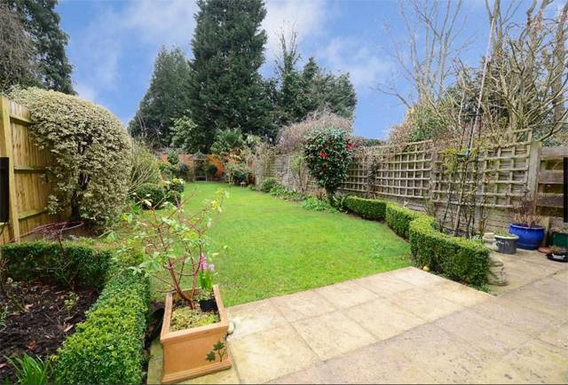
And best of all, is the garden. It's 80ft long, green, peaceful and SOUTH FACING - which was one of our dealbreakers. It is amazing and I'm so glad we moved in before the weather turned so we got to make the most of it.
I haven't got any before pics of Daphne's room as we decorated that pretty much straight away - I'll do a room tour post about it ASAP. The bathroom and downstairs loo are also not worthy of sharing - the bathroom is newish but I find it really horrible and depressing for some reason - I'd LOVE to change it but really we can't justify it.
First of all, we want to build a garden pod for Oli to have as a studio, and then replace the large downstairs toilet with a shower room (there's only one bathroom upstairs). And then change all the flooring - it has cream carpets throughout which are just totally unsuitable for Daph as well as being old and stained. And THEN we have to tackle those horribly upsetting tiles in the hallway and kitchen. I'm not sure what flooring the hallway would have had originally - maybe lino? - as there's just concrete under there. So lots of decisions to make and planning to do. We want to add a 60s/70s vibe about the place, I think, rather than making it super contemporary but we also don't want it to look totally naff. It's quite a challenge!
Review (ish): Setu chair by Herman Miller
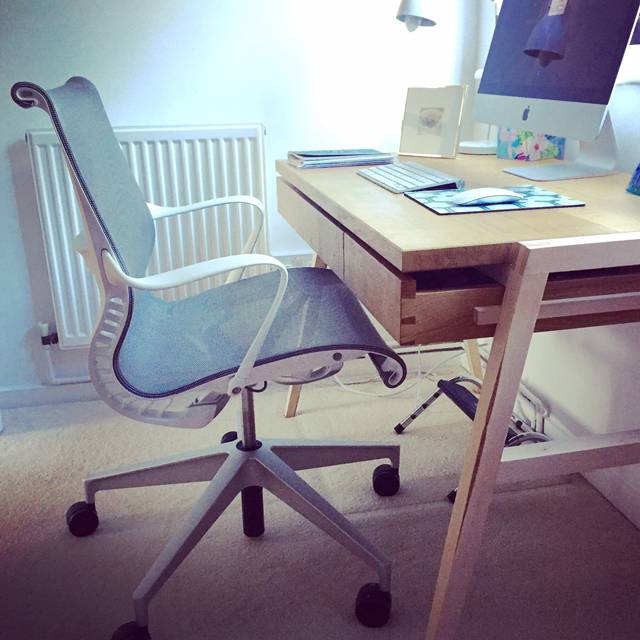 Right so I promised you interiors posts, but I didn't promise you pretty interiors posts (if you want them, may I suggest my friend Vicky's blog Style Made Simple?). I'm starting with this because it's quick and easy for me to blog about (unlike all the decorating/room scheme planning that's been going on and which requires decent photography) but also because it is possibly the most exciting purchase I have made since we moved in. OK, that's a bit of an exaggeration, but it's certainly ONE of the most exciting purchases.
As with most desk-chained work drones, I have had to endure years of backache thanks to uncomfortable 'ergonomic' desk chairs. When I worked at IPC (now Time Inc, but forever IPC to me) and they moved into their fancy new office (which has since been sold off at the same rate as all their magazines) they gave us all these swish Vitra chairs. They looked lovely - all black mesh and sleek curves, but within days I was in agony. I think because I have a ridiculously long back (seriously I can't wear a swimming costume because they don't reach over my nipples), I just can't get on with most chairs that are sculpted to fit. Anyway, we got free physio at work (like I said, this was back in the days when people still bought magazines and there was lots of money floating about) and I took full advantage of this. After using up my six free sessions and still finding work about as comfortable as walking across nails, I complained to my manager, who ordered me a hugely expensive Stephen Hawking-like contraption which, quite frankly, was actually worse.
Oh god, as usual, I'm being ridiculously verbose here - what I meant to say is that I prefer simple chairs rather than someone else's idea of 'ergonomic'. In fact, some of my most comfortable desk days have been sat on a kitchen chair with a cushion under my bum.
But obviously after a while this set-up gets a bit bum-numbing. I have searched high and low over the years for a solution. Just a comfortable desk chair - not too much to ask, right? And then finally I found one in John Lewis. About three years ago - the Herman Miller Setu. I sat on it and it was like being given a great big bear hug from behind. It was LOVELY. I was in love. But I was also wary - much like shoes you try on and prance about the shop in for five minutes that FEEL comfortable, chairs have a habit of turning on you after an hour. The chair was also expensive. Really expensive. I walked away.
But then I came back. Four times. Every time I went to John Lewis I would go and sit in it for as long as I could get away with before whoever I was shopping with wondered where on earth I had gone. And it was always the same: a great big bear hug. So finally, two weeks ago, I ordered one.
It arrived. I was so nervous. I sat in it but it was just as good as I remembered. Everyone who's visited the new house has also sat in it and sighed in envy. It is a good chair. It's not particularly fancy - in fact the only thing you can adjust is the seat height, but somehow this works. You can't tilt the seat or fix the back or raise the arms but this means you've got less chance of locking yourself into some godawful position which seems comfortable at first but is slowly and stealthily crushing your spine.
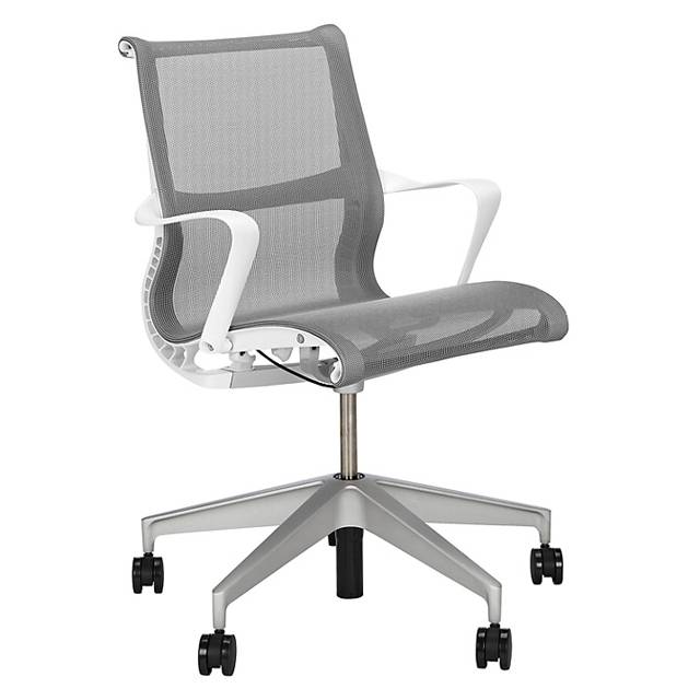
Also, even though I said this wasn't a pretty interiors post, it's a pretty chair right? It's bloody lovely to look at. It comes in lots of sophisticated shades - in fact the 'Berry' one, a kind of navy, was my favourite in the store but after much deliberation I went with the neutral 'Alpine' to match my new office decor.
So yes. If like me, you're in need of a new desk chair and you also can't cover your nipples in a swimming costume, maybe go and have a sit on it in John Lewis for three years too. I reckon you'll be as convinced as I was.
Daphne's nursery tour
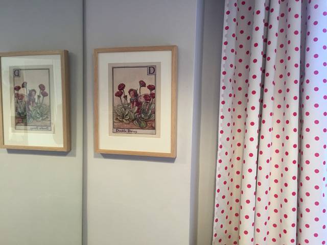 I didn't really want to do a post on Daph's nursery because it's basically been a bit of a... CHALLENGE. It's a teeny tiny room, which I stupidly while pregnant made even tinier by adding a whole wall of mirrored wardrobes. I hadn't realised at the time that this made it impossible to fit a normal-sized cot bed in. I basically used up the one good wall with these damned wardrobes - while we needed the storage, I really didn't think it through.
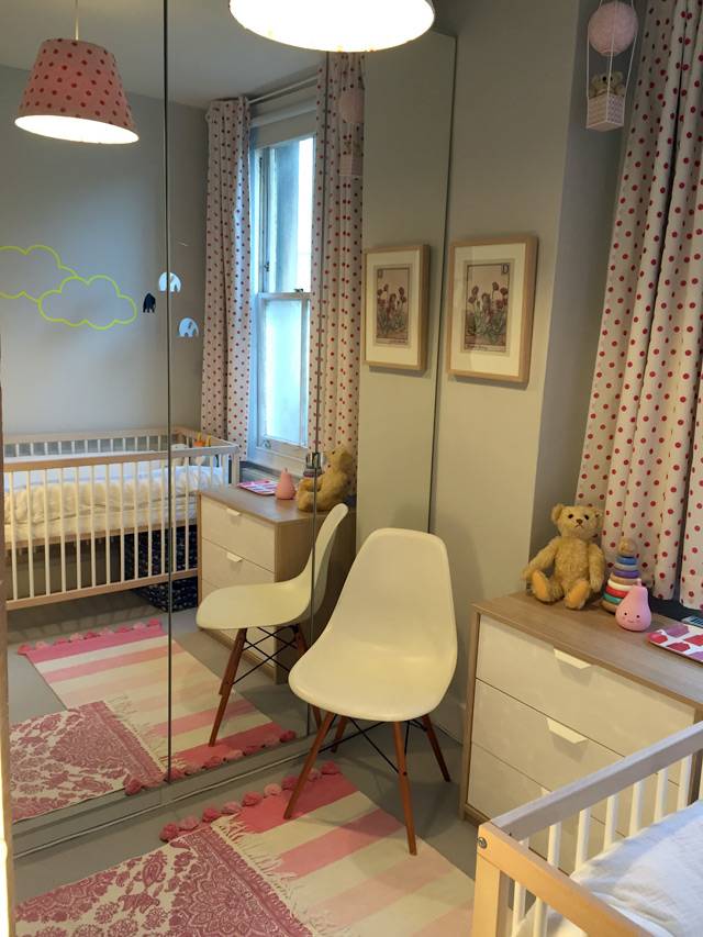
It's also a really weirdly shaped room, with the door at an angle - sort of cutting off one corner of a square. Plus it has an awkward chimney breast sticking out on one wall. Anyway with a lot of measuring and squeezing, we've managed to get in a small cot - the Mokee mini cot in fact - as well as a small chest of drawers and a shelving unit (which we already had). And a chair (although you have to move the chair to get into the wardrobe but luckily I don't need to do it that often!).
It's not the ideal child's room/nursery that I had in mind when I pictured myself as a mother, but despite this, it's actually turned out to be a really cute, happy room. When I'm feeding Daphne last thing before her bedtime, I sit in there and look around at the random mishmash of stuff (and different wood finishes!!) and I can't help but smile. It's ridiculously girly (especially with those pink polka dot curtains that I already had) but it suits a tiny baby girl and I feel like there's plenty for her to look at it, all of which has some story or meaning behind it - as with everything else in my flat.
Here are some more pics... (apologies for the crap photography. The light in this room is also a bit of a challenge!)
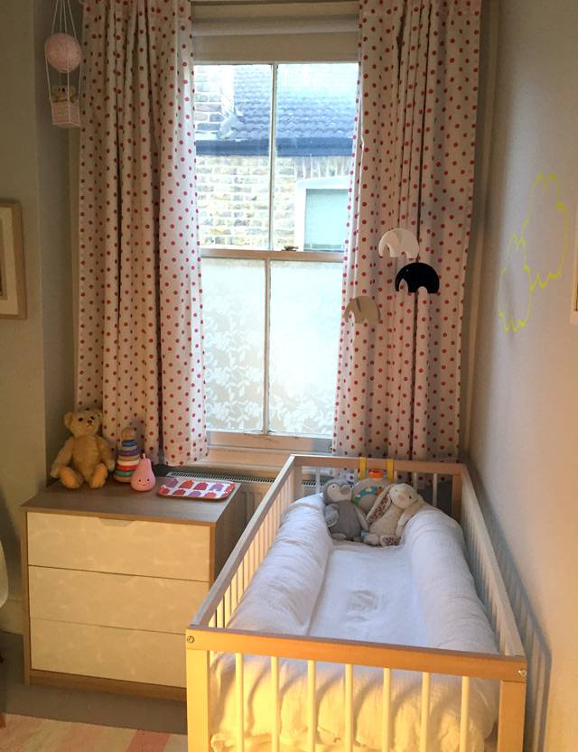
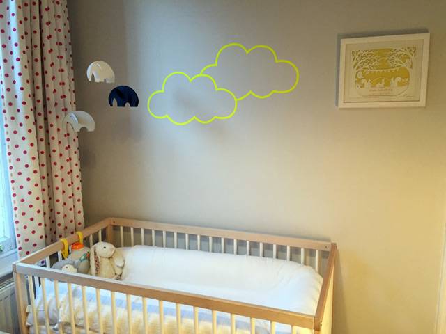
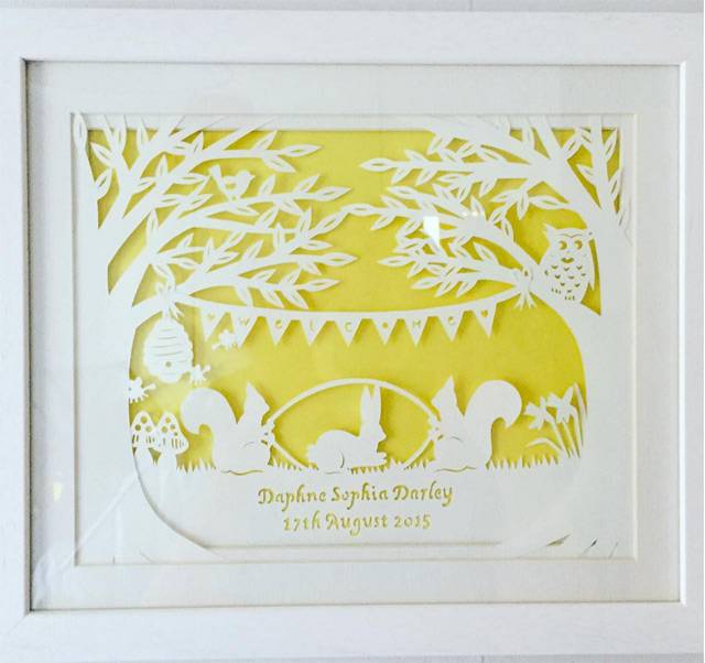
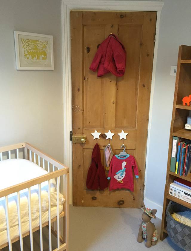
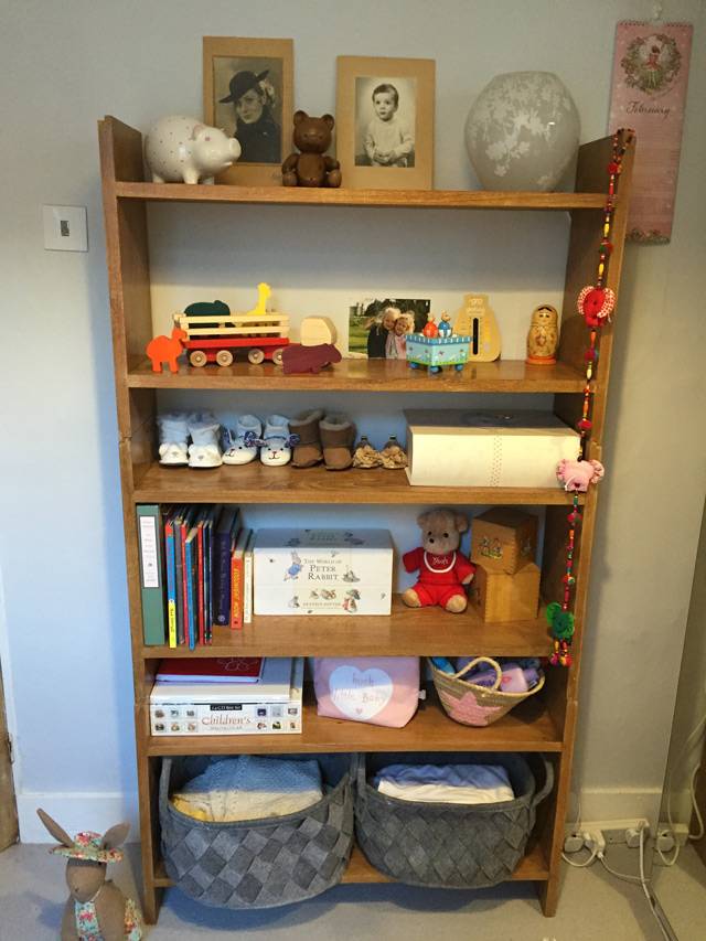
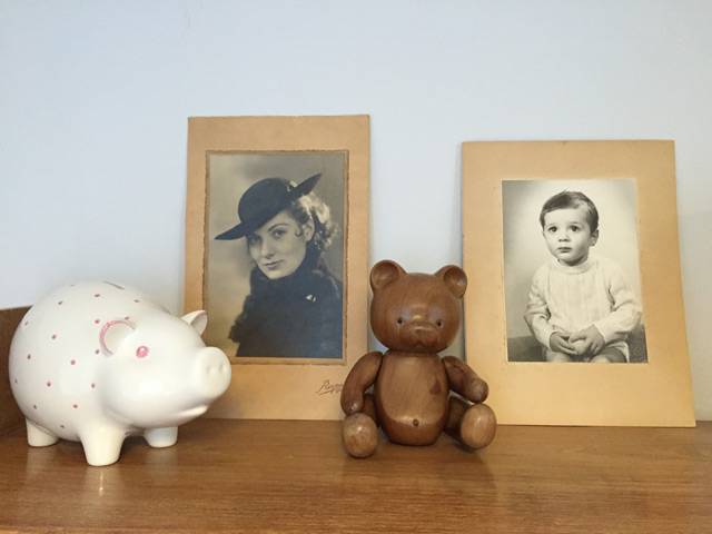
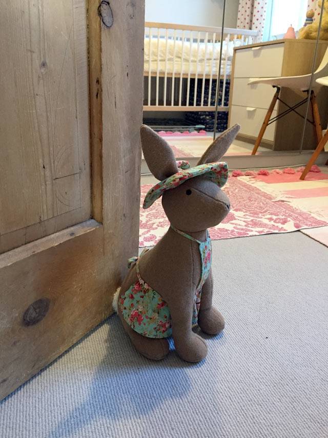
It's a bit cluttered, it's probably a bit too PINK, it was done on a budget, but it's a room full of love. As we're house-hunting this won't be her room for too long (can't wait for more SPACE!), but I think it's quite a good start, and I'm pleased with how we manage to work around the tiny floorplan and create a usable space for her. It's my new favourite room in the flat. I hope she feels safe and happy in there.
Sourcebook: My Bathroom
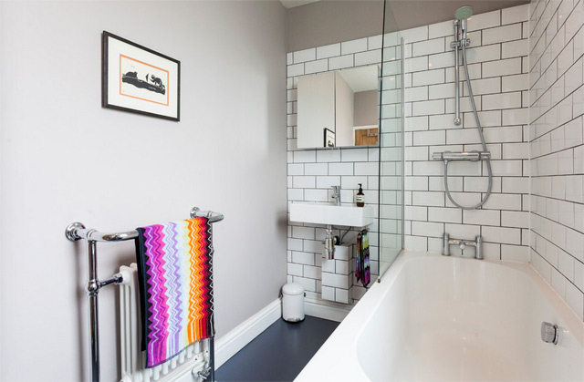 The baby is still enjoying a delightful period of night-time wakefulness (basically, wakes at 2am screaming for no apparent reason - beginning to suspect teething; and then 5.30am whereupon she decides it's time to start the day), so I'm a little sleep deprived at the moment. Hence this rather uninspiring post - the last one detailing all the bits and bobs in my home. I've already done a blog post specifically about my bathroom makeover, but here's a list of all the products you can see in the pictures in case you like any of them!
I've decided not to do a similar post on my kitchen as to be honest very little of it is of my choosing - the cabinets are Ikea and fine but not what I would have picked, the worktop is also Ikea and is a white laminate, the flooring is godawful and I have no idea where it's from, the walls are painted in French Gray from Farrow & Ball. If you want to know any more about it then do drop me a line/leave me a comment.
But enough of that, on to the bathroom - done on a massively tight budget, I think it cost me about £2k in materials and then another £1.5k in labour.
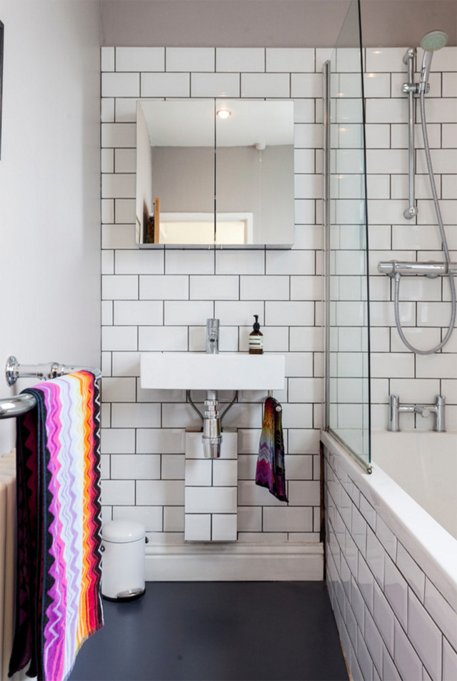
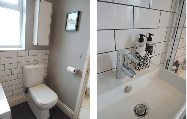
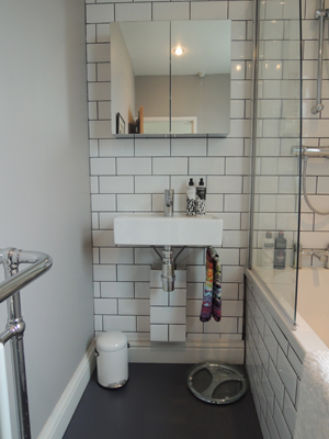
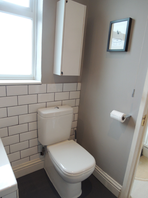
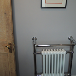
Wall colour, Dove Tale, Farrow & Ball Flooring, vinyl in Slate Grey from The Colour Flooring Company Tiles, Topps Tiles Basin, Bauhaus from CP Hart's trade centre All taps and shower fittings, Grohe from Amazon Towels, Missoni Home from Heal's Bath, was existing bath Toilet, Duravit from CP Hart's trade centre Towel rail, Victoria Plumb Cabinet above basin, Homebase Pedal bin, SimpleHuman Cabinet above toilet, Ikea (spray-painted white)
All photos (except the last two) copyright Houzz UK and taken by the supremely talented Chris Snook.
Sourcebook: My Bedroom
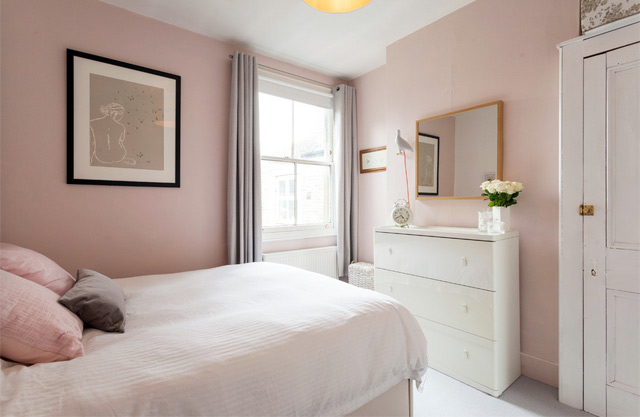 Oh isn't it lovely when you think of an idea for a SERIES for your blog? No effort involved, no racking of brains trying to find something of interest to share with the world. All the hard work is done already.
So here we go, without further delay and following on from my previous post all about my living room, it's time for the lowdown on all the bits and bobs in my teeny tiny bedroom. Yes, I do manage to fit ALL MY CLOTHES into that one built-in wardrobe and chest of drawers. Ha ha ha, only joking.
Enjoy. As ever, please leave me a comment if I've missed anything off or you have any queries! I do love talking interiors.
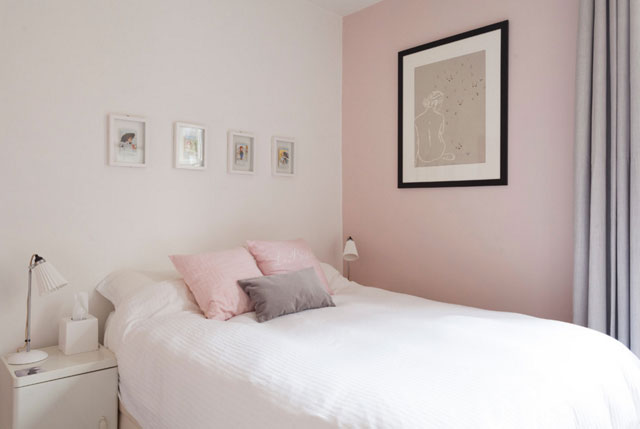
Wall colour (pink), Calamine, Farrow & Ball Wall colour (white), Brilliant White, Dulux Bed, Loaf Bedside tables, Ikea Bedside lamps, Original BTC Screenprint, by Clare Cutts from Baxters Gallery Framed postcards, frames from Habitat, postcards inherited Tissue box, The White Company Bedlinen, Laura Ashley Cushions, H&M Curtains, Dunelm Mill Storage baskets on top of wardrobe (just seen in first pic), Ikea
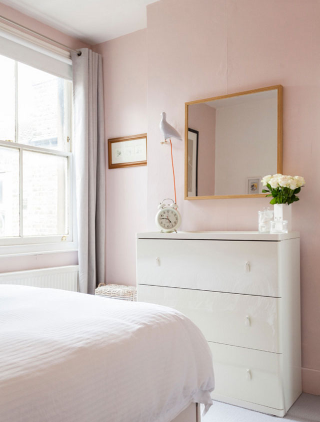 Chest of drawers, Ikea
Clock, Heal's
Mirror, Ikea
Pigeon light, Thorsten van Elten
Wicker washing basket, Debenhams
Vase, inherited
Glass storage jars, The White Company
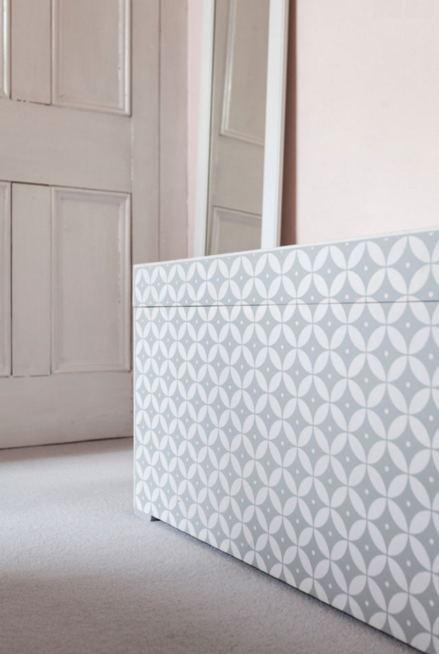
Carpet, Wool Cord in Moon, Alternative Flooring Ottoman, Loaf Mirror, taken from an old wardrobe door, painted in Ammonite, Farrow & Ball
All photos copyright Houzz UK and taken by the supremely talented Chris Snook.
Sourcebook: My Living Room
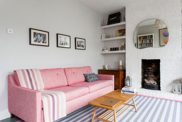 OK, so apologies, I agree, 'Sourcebook' is supremely wanky. Who do I think I am? An interior designer? Fear not, no, I know my place - I just couldn't think of anything else to call this post.
Since my flat was featured on the very lovely Houzz UK a few months ago, and since I will very soon (hopefully) be moving out of it (if we can ever find anywhere to live), I thought I'd put some details down on the blog of where everything in each room is from. Lots of people keep getting in touch and asking me for details about things, and it's really LOVELY because it means I must have SOME taste (despite someone on Houzz commenting that my flat was 'a hybrid of girlie, retro, seaside, student, office, modern, with a twist of chic that I'm finding difficult to love' - I mean personally, I think that sounds kind of awesome, but hey, I guess I would).
First up, because it's the one with the most stuff in it: my living room. So here's a grand old list of where everything is from, in case you're interested. And, yes, I know, this blog post requires no creativity on my part. Ha.
Some things may no longer be available as they've been accumulated over several years - if so drop me a line and I'll try to find an alternative for you.
Hopefully I haven't missed anything - feel free to leave a comment if so and I shall get back to you forthwith!
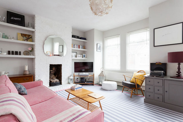
Wall colour, Ammonite, Farrow & Ball Chimneybreast colour, White - not sure, probably Dulux Brilliant White Floor paint, Downpipe, Farrow & Ball Rug, bespoke from Alternative Flooring Sofa, Fancy Nancy, Sofa Workshop Coffee table, Ercol (from eBay) Armchair, Ercol (inherited) TV stand, Heal's vintage Grey chest, Garrat Storage Chest, Laura Ashley, painted in Plummett (I think! can't remember), Farrow & Ball Mirror above fireplace, 60s dressing table mirror from a junk shop White leather pouf, Heal's Large lantern, Nordic House Small lanterns, Debenhams Ceiling light, Habitat Blinds, Ikea Cushion on sofa, Sparrow & Co Throw on sofa, Melin Tregwynt Cushions on armchair, MissPrint (yellow) and Mini Moderns (grey) Chest of drawers in corner, antique, inherited (I would paint them but the top has a lovely patina so can't bring myself to) Art above sofa (not seen here but on first pic), framed pages from an old Vogue calendar
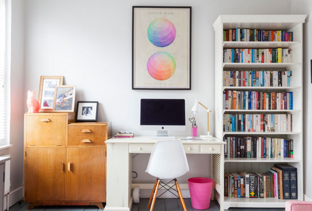
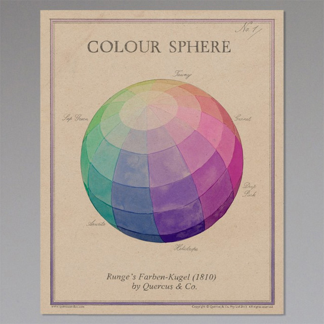
Bureau, inherited from my grandparents, 1950s Desk, The Pier - remember them!? I hate my desk and I actually have this amazing Sebastian Cox for Heal's one waiting for me in storage at the moment... if we can ever find that aforementioned new house Desk chair, Eames DSW Colour Sphere wall print, A Rum Fellow Bookcase, Ikea (where else!) Bunny lamp, The Little Baby Company Desk lamp, Homebase Bin, Ikea
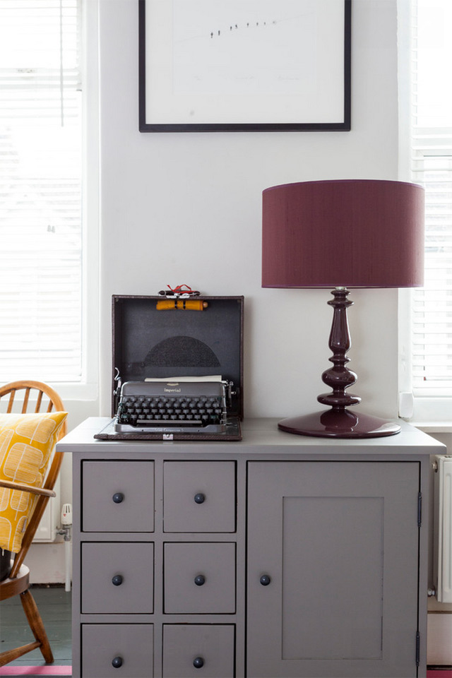
Lamp and shade, Habitat Typewriter, eBay Chest of drawers, as before Lithograph by Alan Stones, from Baxters Gallery, Dartmouth
All photos copyright Houzz UK and taken by the supremely talented Chris Snook.
Have a nose round my home on Houzz
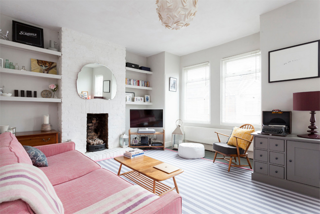 I'm very excited today to be able to share with you the feature on my flat on international decorating goliath Houzz. The lovely team at Houzz sent a fab interiors photographer (Chris Snook - check him out) round a few weeks ago to shoot my humble abode to feature as part of their new series visiting interiors bloggers at home. I then had a chat with one of their writers to talk more about my blog, as well as the story behind the bits and pieces in my home.
It's funny, seeing the finished pics, as I had never realised quite how girly my taste had become! And quite how dependent on grey and pink... what can I say, the two work together so well! It's been really lovely to have these professional shots done, especially as when my flat was last shot for The Guardian, it looked quite different.

My home really is an amalgamation of lots of different bits and pieces gathered throughout the years - many of which were handed down to me from relatives, resulting in a rather eclectic mix. But I quite like the fact that pretty much everything I own has a story behind it, rather than it all being bought at once to fit a particular design 'scheme'.
The Houzz team also asked me to pick out a prize for the best comment left on the feature. They wanted me to choose something inspired by or featured in my flat - so I went with this fab poster from A Rum Fellow (below). It takes pride of place above my desk in the living room, and always gets tons of compliments.
So what are you waiting for? Get over there, have a good nose round and leave a comment (be kind please, have I mentioned at all lately that I'm heavily pregnant and emotional?!)!
Can't wait to hear what you think!
PS to see all the shots Chris took, check out My Home ideabook
Hospital flooring
 |
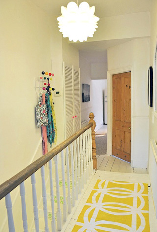 |
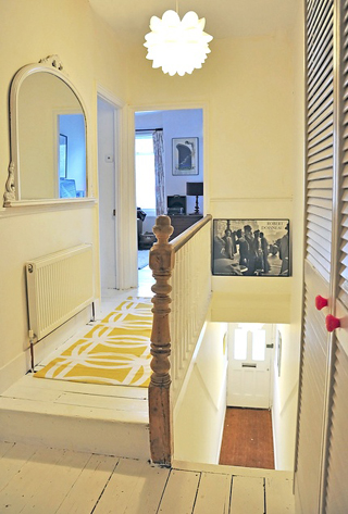
When I moved into my flat, it was carpeted throughout the hall, bedrooms and living room. With worn blue speckled carpet that was stained in places thanks to the geriatric, incontinent cat that formerly lived there. One of the first things I did when I moved in was rip up all the carpets, including painstakingly taking up all the gripper things that were nailed round the edges of every single room. I had a week to sort out the flooring before I had to move in, so I slapped floor paint on all the floorboards, resolving to decide on a more permanent solution once I'd settled in.
And actually, for the last two and a half years, I've really liked my painted floorboards. But over time, and in the hall especially, they've started to look really really worn. 'Not so much shabby chic,' as my dad said the other day, 'as just shabby.'
But the problem is, I'm completely stumped as to alternative solutions. I considered a stair runner but I can't find any designs I particularly like, and they just don't feel very 'me'. Laying engineered wood flooring is another possibility, but it doesn't really fill my heart with glee - it just seems safe, and a bit boring. It also doesn't really help me sort out the stairs, which are also painted white and although aren't as scuffed as the hall, are beginning to look a little worse for wear.
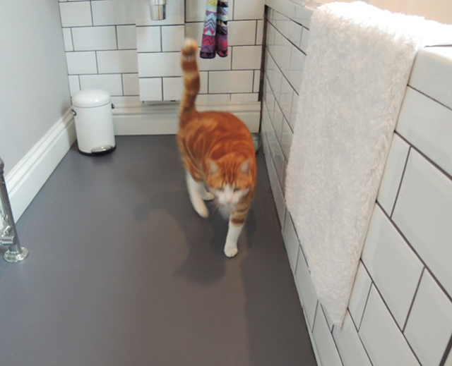
When I redid my bathroom last year, I laid grey vinyl from the Colour Flooring Company on the floor - and although it was really just a practical decision at the time, I absolutely love it. It's so easy to keep clean and is so warm underfoot and feels very hardwearing. It's super cheap. And I think it looks really smart.
So yesterday I had the bright idea of laying vinyl flooring throughout the rest of the flat too. Well, on the top floor hallway, and in my bedroom. I thought I'd keep my stairs white, and just repaint them. I was thinking of a pale grey for the hallway and white for my bedroom. Excited, I scoured Pinterest for inspiration and I thought my problems were solved!
I even had grand plans about ripping up the existing flooring in the kitchen (horrible beige vinyl tiles) and replacing it all with a flat run of this stuff. But then I told my dad.
And he said it would make the flat feel like a hospital.
And then I told my friend Vicks, of The Relaxed Home fame, and she said it would be a nightmare to keep clean.
And so now... I'm just not sure again. Help!
The paint snowball
It all started with a door. Well, no, that's not quite true. It all started with a cat. And the need to shut him out, which resulted in this shiny new (old) door on my kitchen, from Architectural Salvage in south Wimbledon.
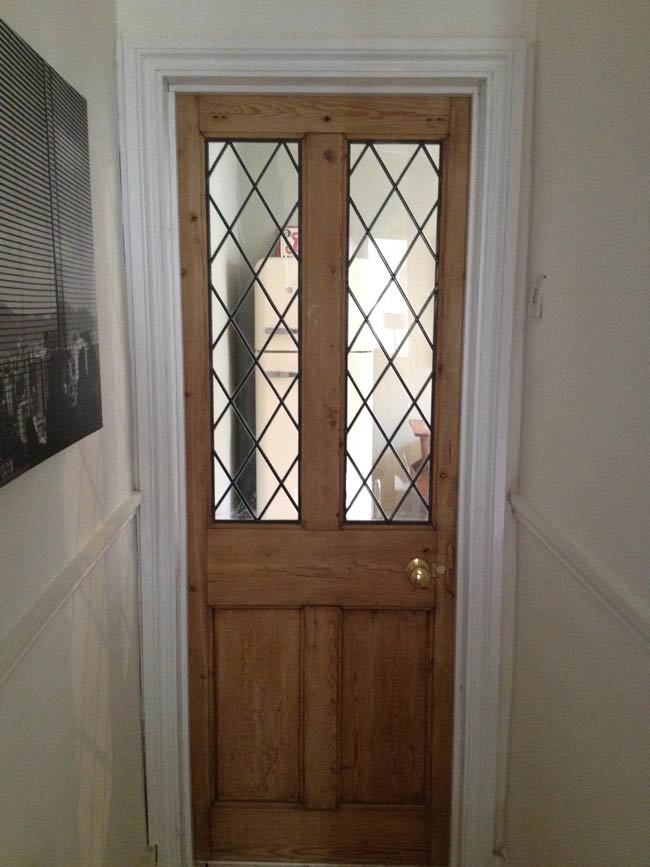
Once the door was installed, I had to paint around the brand new doorframe. So I did (which is why it looks so shiny and white in comparison with the walls). The shiny white doorframe continued on the other side too, inside the kitchen. Result of shiny white doorframe? The kitchen walls looked really, really shabby.
You may remember my kitchen looked like this:
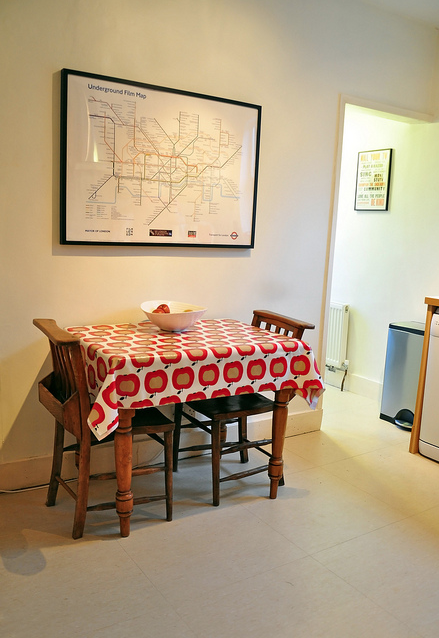
Nice enough, but a bit 'meh'. Enter Farrow & Ball's French Gray...

Move one fridge...
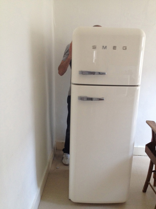
Several hours and sore arms later, you get this...
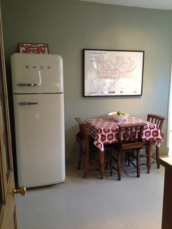
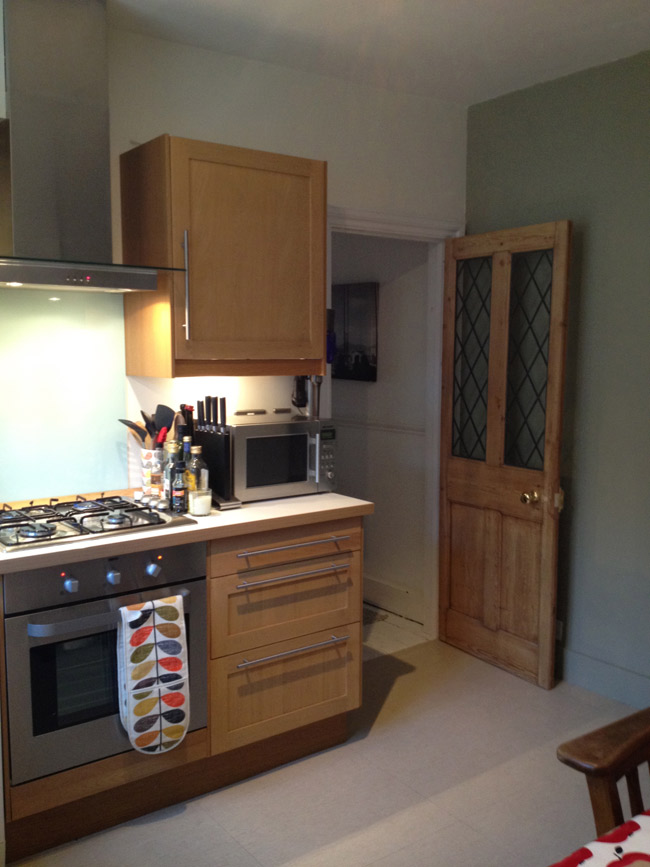
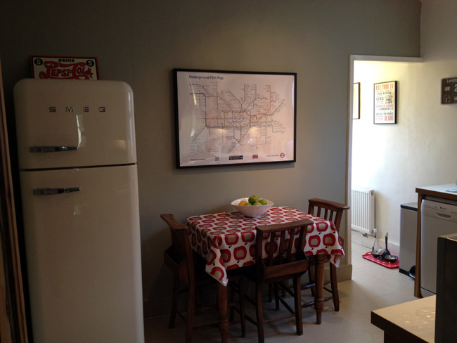
I love it! So much warmer and more inviting. The trouble is, of course, now the hall walls look really, really shabby...
Bathroom reveal
So...it's been a while since I finished my bathroom, but I was waiting for some LIGHT and SUNSHINE in order to photograph it. But look, we had five minutes of the stuff on Tuesday and now it's buggered off again. So I've given up. Here's the bathroom, in the delightfully dull March light we're all now so depressingly used to. Am hoping that by posting this, the sun will decide to appear and stick around, just to spite me for not waiting a little bit longer. You may remember my personality-less bathroom from my post before here...
Grim eh? But here it is now... *ta-daaaa*
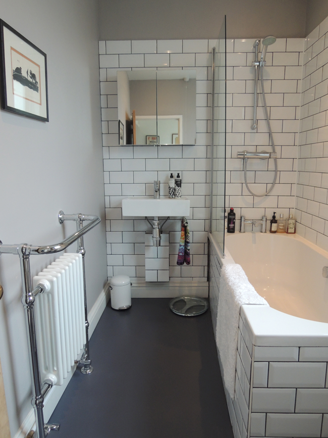
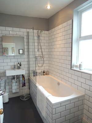
As you'll see, I didn't have the guts to go for the greeny-blue walls in the end. I was massively tempted, but decided it would look out of place with the rest of the flat, which is very light and bright. And also my uber-stylist friend Poppy Norton reminded me that if you want to do your make-up in them, it's good to keep bathrooms light as possible. The wall colour I went for in the end is Dove Tale, by Farrow & Ball, and is a really interesting shade - that goes from very pale purpley-grey to a sort of warm mushroom-brown, depending on the time of day. It's great because it gives the cosy feel I was after, without being too dark.
 |
 |
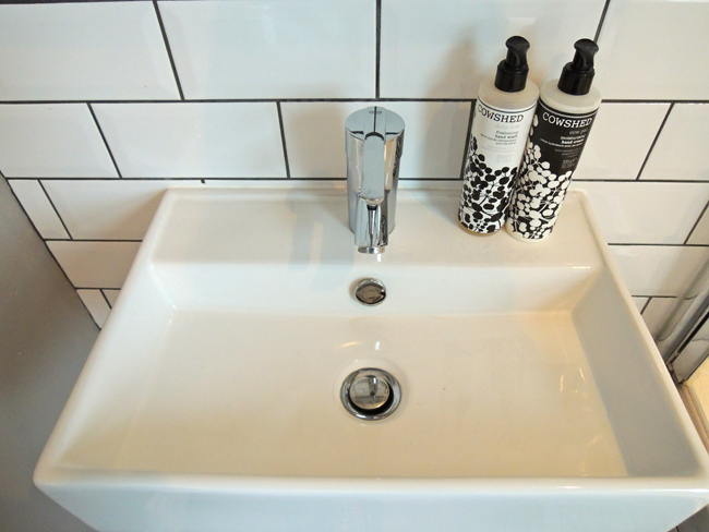
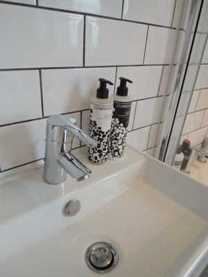
The sanitaryware was a bargain - the basin (Bauhaus) and toilet (Duravit) were both from CP Hart's trade centre. I reused my existing bath. The shower and basin and bath taps are Grohe, and I bought them on Amazon!
 |
 |
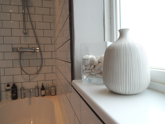
 The flooring is from the Colour Flooring Company - and I love it! So soft and warm underfoot. The tiles are from Topps Tiles.
 |
 |
In total I spent just over £3k, including fitting, which I think is pretty good. It's not perfect, and as with any interiors junkie there are a few things that I wish I could change - or could have afforded to have done - but the main thing is it has personality, is warm and inviting, and puts a smile on my face first thing in the morning!


