Sourcebook: My Bathroom
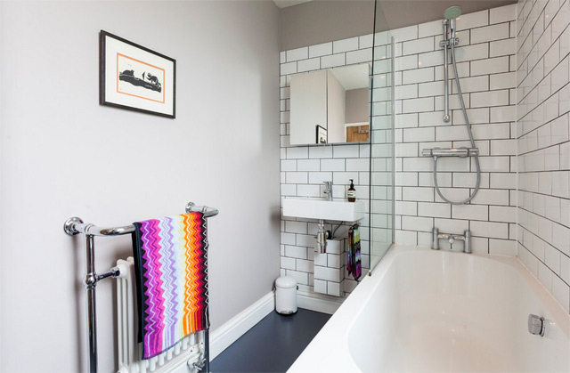 The baby is still enjoying a delightful period of night-time wakefulness (basically, wakes at 2am screaming for no apparent reason - beginning to suspect teething; and then 5.30am whereupon she decides it's time to start the day), so I'm a little sleep deprived at the moment. Hence this rather uninspiring post - the last one detailing all the bits and bobs in my home. I've already done a blog post specifically about my bathroom makeover, but here's a list of all the products you can see in the pictures in case you like any of them!
I've decided not to do a similar post on my kitchen as to be honest very little of it is of my choosing - the cabinets are Ikea and fine but not what I would have picked, the worktop is also Ikea and is a white laminate, the flooring is godawful and I have no idea where it's from, the walls are painted in French Gray from Farrow & Ball. If you want to know any more about it then do drop me a line/leave me a comment.
But enough of that, on to the bathroom - done on a massively tight budget, I think it cost me about £2k in materials and then another £1.5k in labour.
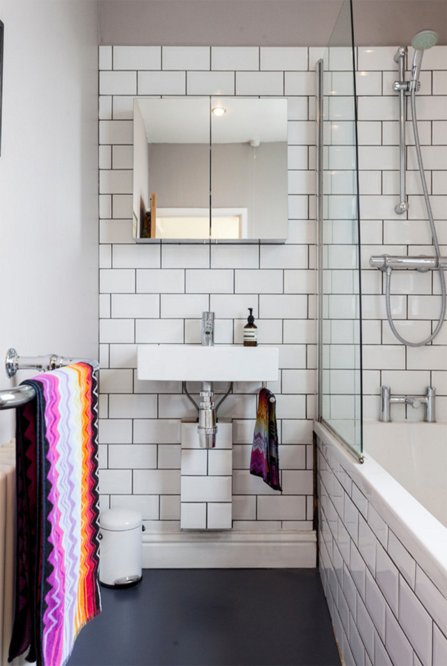
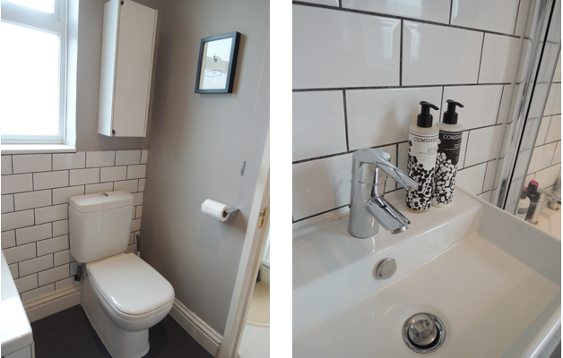
Wall colour, Dove Tale, Farrow & Ball Flooring, vinyl in Slate Grey from The Colour Flooring Company Tiles, Topps Tiles Basin, Bauhaus from CP Hart's trade centre All taps and shower fittings, Grohe from Amazon Towels, Missoni Home from Heal's Bath, was existing bath Toilet, Duravit from CP Hart's trade centre Towel rail, Victoria Plumb Cabinet above basin, Homebase Pedal bin, SimpleHuman Cabinet above toilet, Ikea (spray-painted white)
All photos (except the last two) copyright Houzz UK and taken by the supremely talented Chris Snook.
Once upon a time...
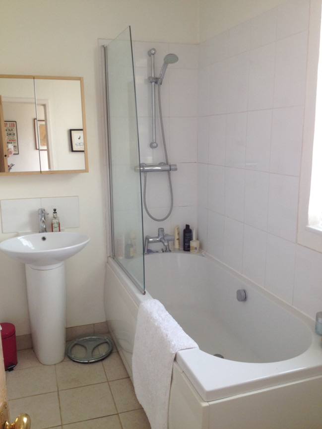 ...there was a bathroom. A bathroom without personality.
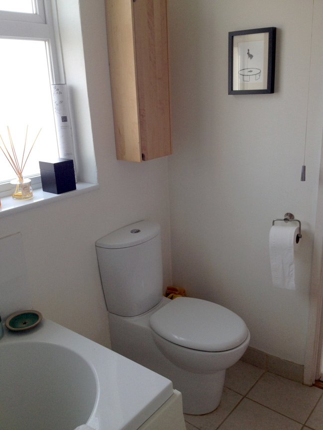
It was a perfectly acceptable bathroom. It served its purposes - except for the basin tap which had long since checked out of life. But other than that, it worked well enough - it was warm, the shower was powerful, the toilet, er... flushed.
But it was a sad bathroom. It wanted nothing more than a splash of colour, some flair, some love and attention. Some personality.
So that's what it's getting.
Here's my first attempt at a moodboard. Please don't laugh too much - I never did get the hang of Photoshop's marching ants.
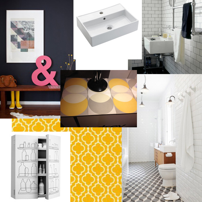
My grand plans for a beautiful encaustic geometric floor were sadly put paid due to time and budget constraints, but I'm determined to get some mustard in there somewhere... maybe through some fluffy new towels. I've also been advised against the dark wall as the room is quite small and bathrooms need to be light to be functional, but isn't that teal-grey-navy a beautiful shade? It's similar to my front door, which is Farrow & Ball's Down Pipe.
The look I originally wanted for my bathroom was based around the concept of 'abattoir chic' (I like to think I coined this phrase, but I probably didn't). So I'm sticking to that theme, more or less.
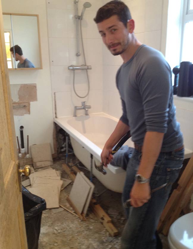
The last time I saw it, the bathroom was looking significantly worse for wear (that's my lovely fitter Fred in the pic). Fingers crossed its makeover is a success! I'm fairly confident that whatever it ends up looking like will be better than the bland magnolia wasteland I started with.
Watch this space...
